Color Harmony: Creating a Cohesive Look Throughout Your Home Apr 13, 2026
The first step towards color harmony is understanding the color wheel. This tool is crucial as it helps you comprehend how colors interact with each other. Familiarizing yourself with terms such as complementary, analogous, and triadic color schemes can assist in selecting hues that work well together. Complementary colors, for instance, are opposites on the wheel and can add vibrancy to your interiors, while analogous colors, which sit next to each other, create a serene and comfortable vibe.
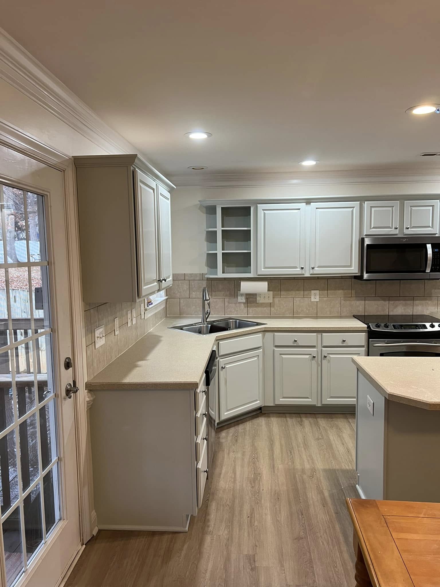
Before diving into painting, it is essential to consider the role each room plays in your home. Each space has its unique function, and the color should reflect the desired mood and activity. For instance, the living room might benefit from warm, inviting colors that promote social interaction, while bedrooms often require softer, calmer tones to facilitate relaxation. Consider the amount of natural light each room receives, as this can significantly impact how colors appear.
Once you understand the purpose of each room and the effect of light, it's time to decide on a base color. The base color should act as the anchor for your palette and be used in different shades and tones throughout your home. This approach creates a consistent thread of cohesion from room to room. At Strive Painting, we recommend choosing a neutral or subtle base color, as it provides flexibility when introducing accent colors.
Accent colors are another crucial aspect of color harmony. These colors should complement your base color and can be used to highlight architectural features or bring attention to specific areas. They can add depth and interest without overwhelming the senses. Experiment with textiles, artwork, and furnishings to see which accents resonate with your overall design aesthetic. Remember, less is often more. Strategic placement of accent colors can enhance your home’s look significantly without disrupting harmony.
Texture and finish also play an integral role in achieving color harmony. Different finishes reflect light uniquely and can alter the perception of color. A satin or semi-gloss finish can make a space feel larger and reflect light, while a matte finish provides warmth and softness. Mixing textures, such as combining a matte wall with gloss trim, can add another layer of sophistication and interest to your home’s design.
Integrating nature-inspired colors can also aid in creating a cohesive look. Earthy tones like greens, browns, and soft blues can bring the tranquility of the outdoors inside, providing a calming and consistently appealing environment. These colors seamlessly blend across spaces and allow for an organic transition from one room to another.
In conclusion, achieving color harmony in your home involves a balance of understanding color relationships, considering room functionality, and strategically applying colors and finishes. Strive Painting is here to assist you through your color journey, ensuring that your home not only looks cohesive but also feels uniquely yours. Trust that by applying these principles thoughtfully, you will create an inviting, harmonious living space that reflects your personal style.
/filters:no_upscale()/filters:format(webp)/media/d8ff7673-6c86-420e-9a08-29eb71cb9a0f.jpeg)